prints, drawings, paintings, web development, blog posts, link to etsy shop
Deconstructing and Reconstructing Color - a Conceptual Print
Deconstructing and Reconstructing Color - a Conceptual Print
A few weeks ago I had a new idea for a color print precipitated by my experimentation with carborundum on plastic plates. Until then, I had longed to do a true color intaglio print, but I lacked inspiration for creating the right image or determining how to build the color. It couldn't work like a reduction linocut, no matter how hard I thought about it.
My new idea had the potential to work perfectly or be the stupidest idea ever. Either way, good or bad, the thing I liked about it was it would be a conceptual piece, and, thus, I had to pursue it.
I conceptualized four intaglio plates - inked and printed in the four traditional process colors: cyan, magenta, yellow, and black (CMYK in the industrial print world). I thought about it for several weeks. Was it possible to create 4-color separations by hand (i.e, not using a photographic plate process) and print them together so that the colors "mixed" to recreate the original image? Sure it's been done with half-tone film separations and solar plates, but by a hand process? As a concept, I was motivated enough to attempt it with my new favorite material: carborundum grit. After all, aren't half-tones just a dots anyway?
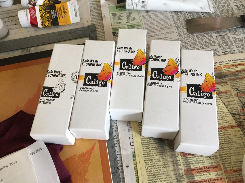
The first problem was that I didn't have process color inks with some degree of transparency. The Akua etching inks did not come in process colors (but to be fair, I found references online citing which ones could double as process colors). After an exhaustive search, I found a company in the UK called Cranfield that sells Caligo Safe Wash etching ink in the process colors: cyan, magenta, yellow (and black). I was so excited to find them, I ordered them instantly - even before I had an image to work with.
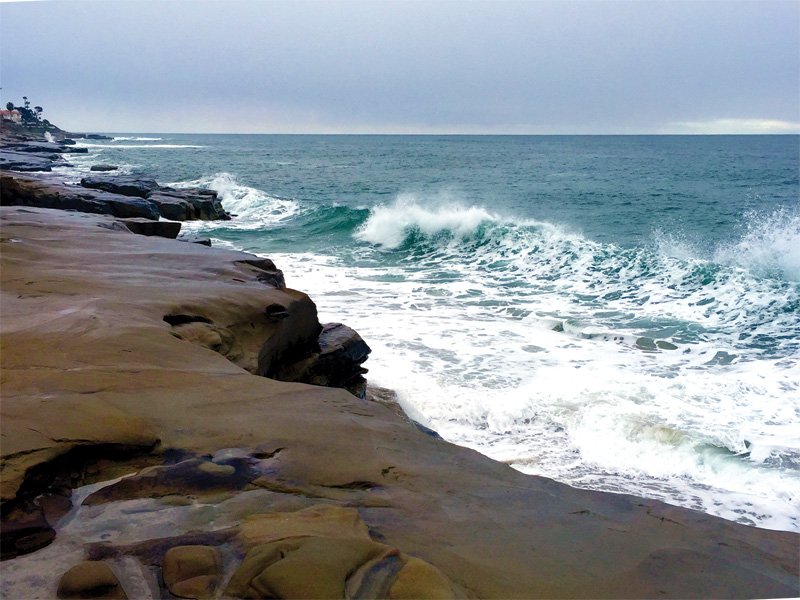
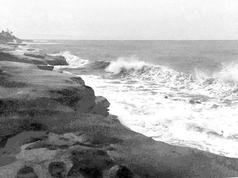
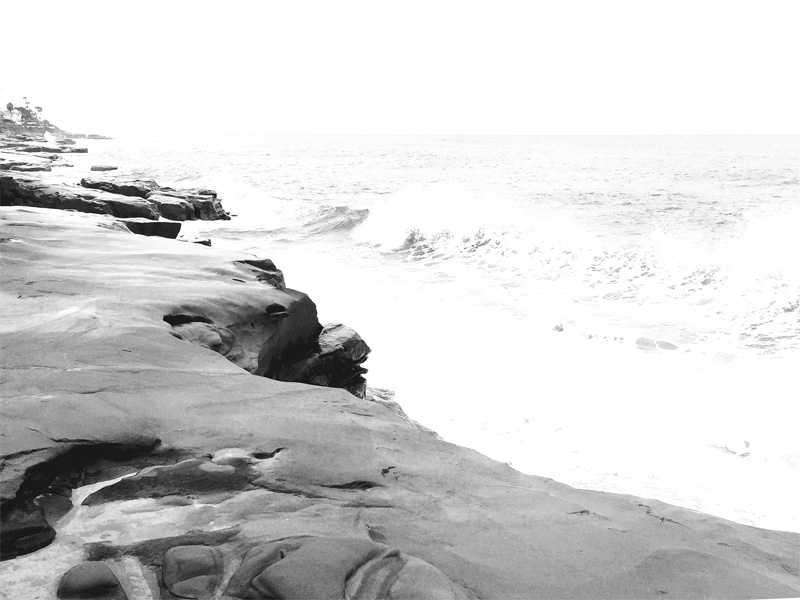
Obviously, the next step was to find an image. I scanned a bunch of recent photos for something generic and came up with a photograph I took in January of the La Jolla coastline. Except for a blue sea, most of the colors in the image were muted or neutral. Here's the original image, reversed horizontally for making the plates:
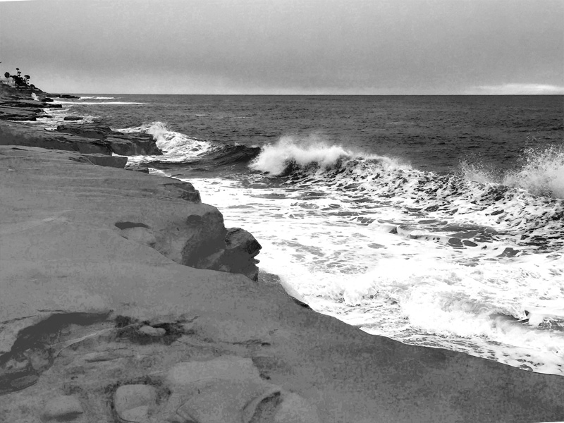
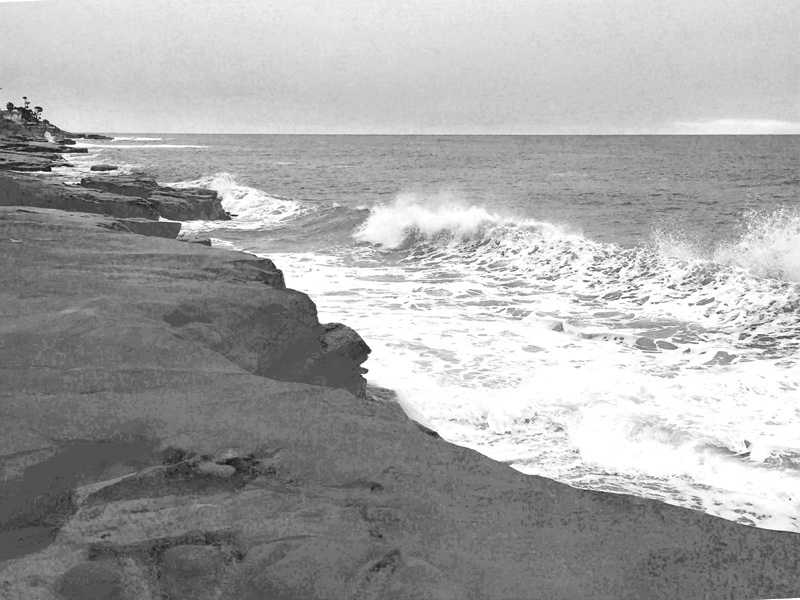
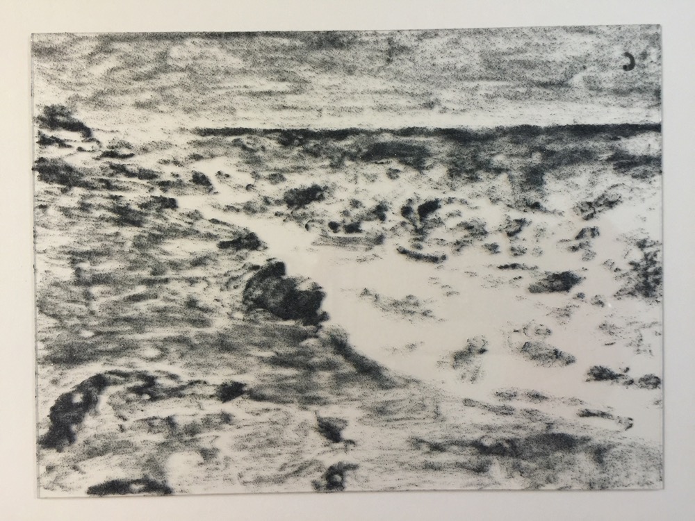
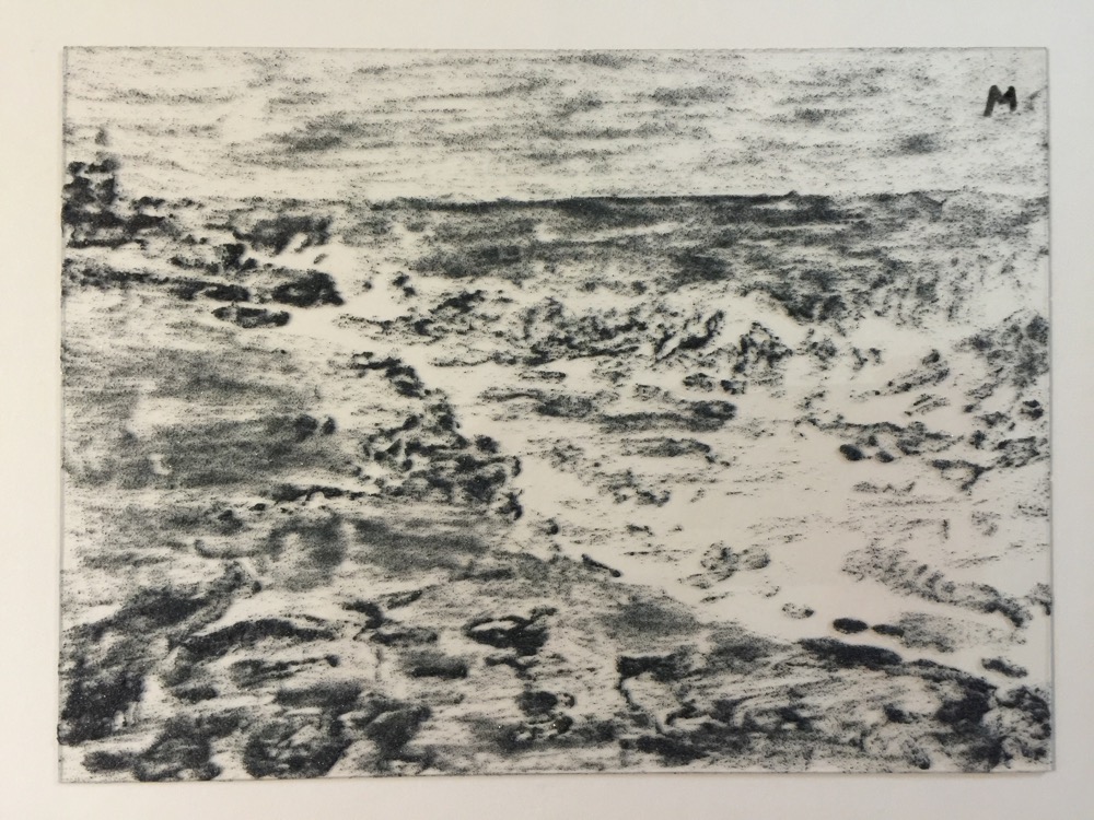
The next step was to use Photoshop to convert the image to CMYK mode, resize it, and print out the color separations (this was something I did all the time when creating films while working in the print industry). I didn't print them as half-tones because I didn't need photographic precision - I just needed black-and-white separations. Here they are:
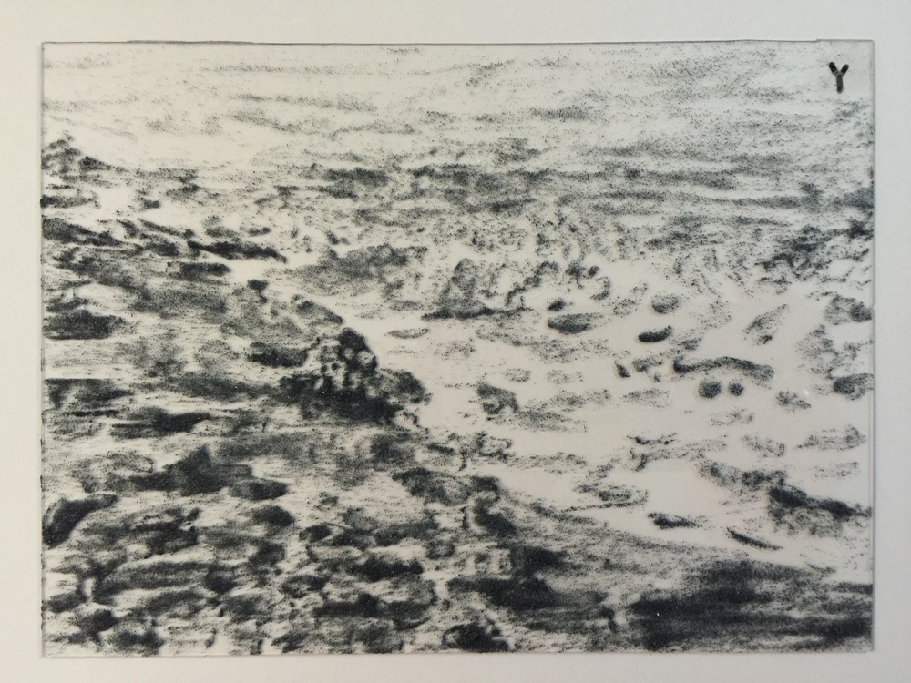
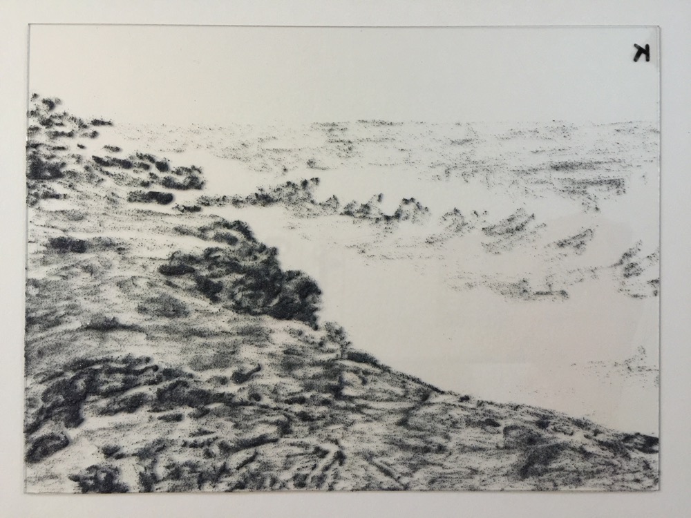
Cyan - notice how dark the sea is - it's mostly blue (cyan):
Magenta:
Yellow:
And black (note the lack of black in the sea because it's mostly saturated color):
The next step was to cut four identical plastic plates, one for each color, and paint the carborundum grit on them using the above images as guides. I used a higher concentration of grit for the darker areas and tried to guess how much to use in the "gray" areas. I used acrylic gloss varnish as the medium to suspend the grit.
Here are the four plates after they were painted with carborundum. I wasn't going for perfection, and I am far from fully understanding the best way to adhere grit to a plate.
The cyan plate:
The magenta plate:
The yellow plate:
And the black plate:
Once the plates were painted, I sprayed them with gloss varnish to make the wiping a little easier.
When the plates were fully dry, the next step was to print them. I have been reading and watching videos about how to print and register multiple color intaglio pates. There are several methods. It's general practice to print all the colors at once, i.e., wet the paper, ink all the plates, then run them through the press one by one. However, there are multiple ways to register the plates. Some printmakers flip the print face up after each color and overlay the next plate on top, registering it directly onto the previous color. Then they can flip it back over and run it through the press again. Other printmakers put registration marks for both the plate and the paper on the press bed before starting and just line everything up after each color. I chose a slightly modified version of the second method. I drew registration marks on the press bed for the plates, then ran my first color through. I stopped the press roller before the paper was clear, allowing me to pull the print and wrap (drape?) the paper around the top of the roller. Then, I removed the already-printed plate, wiped the press bed between each color, and lined up the next plate with the registration marks. The paper - one end still trapped under the roller - could then be laid down on the plate, perfectly aligned, and rolled back through offsetting the next color.
Look! Process colors!
I was able to make two prints in about two hours as it takes a while to ink and wipe four plates and get everything clean and positioned. I didn't know how transparent the inks were, and I also had no clue what order to print the colors, so I experimented. For the first print, I used one part ink mixed with an equal part transparent extender and printed dark to light - cyan, magenta, yellow, black. My thought was that lighter colors would overlay darker colors better with transparency. Here's what I got - a very saturated image with not as much mixing and more opacity than I wanted. It was also very hard-edged:
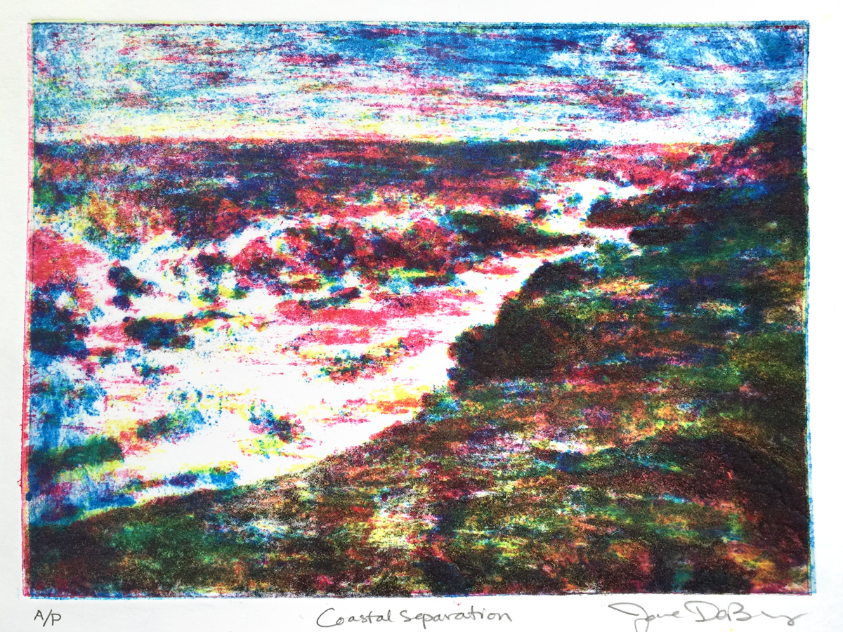
I wasn't satisfied with this image, so I tried again - this time mixing the inks more transparent (using about one part ink to two parts transparent extender). I also decided to print the plates in reverse order - yellow first, followed by magenta, cyan, then black. And finally, I wiped a little less vigorously to avoid removing too much ink from the more subtle areas of grit and hopefully creating a softer edge. Here's the second proof:
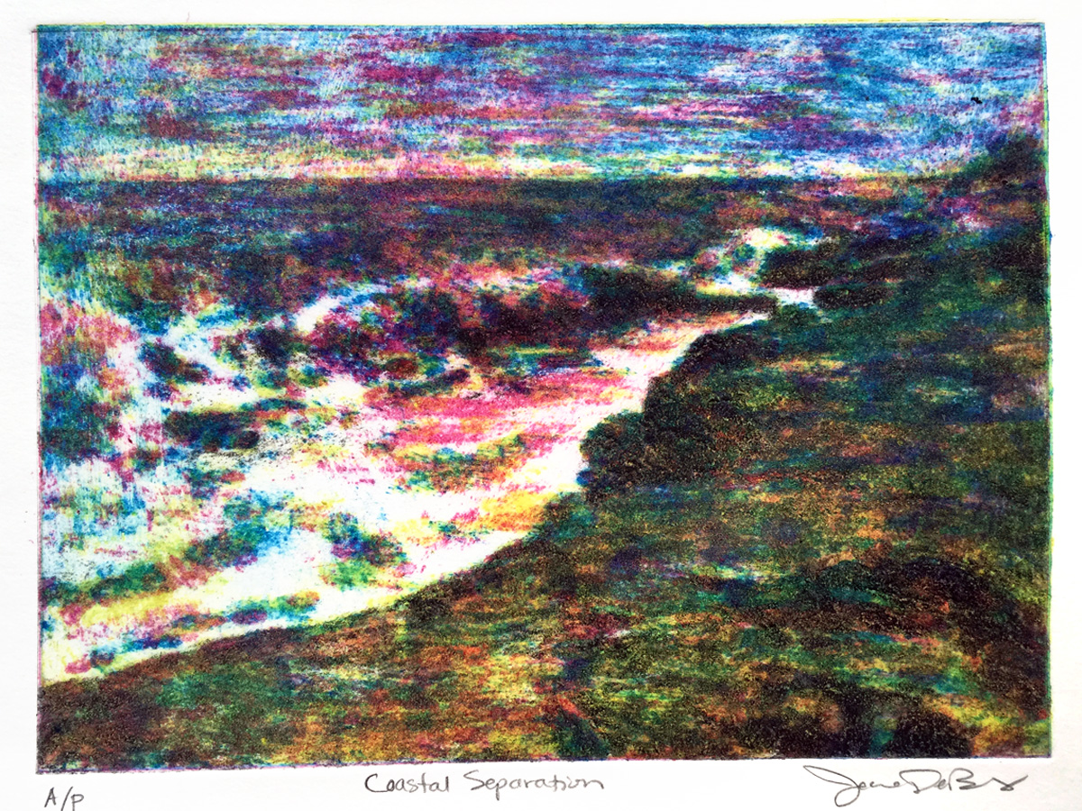
At first, I thought it was another disaster, but then I realized the color mixing was actually quite complex and maybe it was the furthest thing FROM disaster. No matter what you think, it's the most cerebral attempt at printmaking I've ever made. It might even be the closest I've come to applying a painterly technique to my printmaking. I plan to explore this concept much futher - I know both to the inking process and laying down of texture on the plate can be improved and refined.
As usual, to see the results of my future experiments, stay tuned...