prints, drawings, paintings, web development, blog posts, link to etsy shop
The Next Color is... Violet?
The Next Color is... Violet?
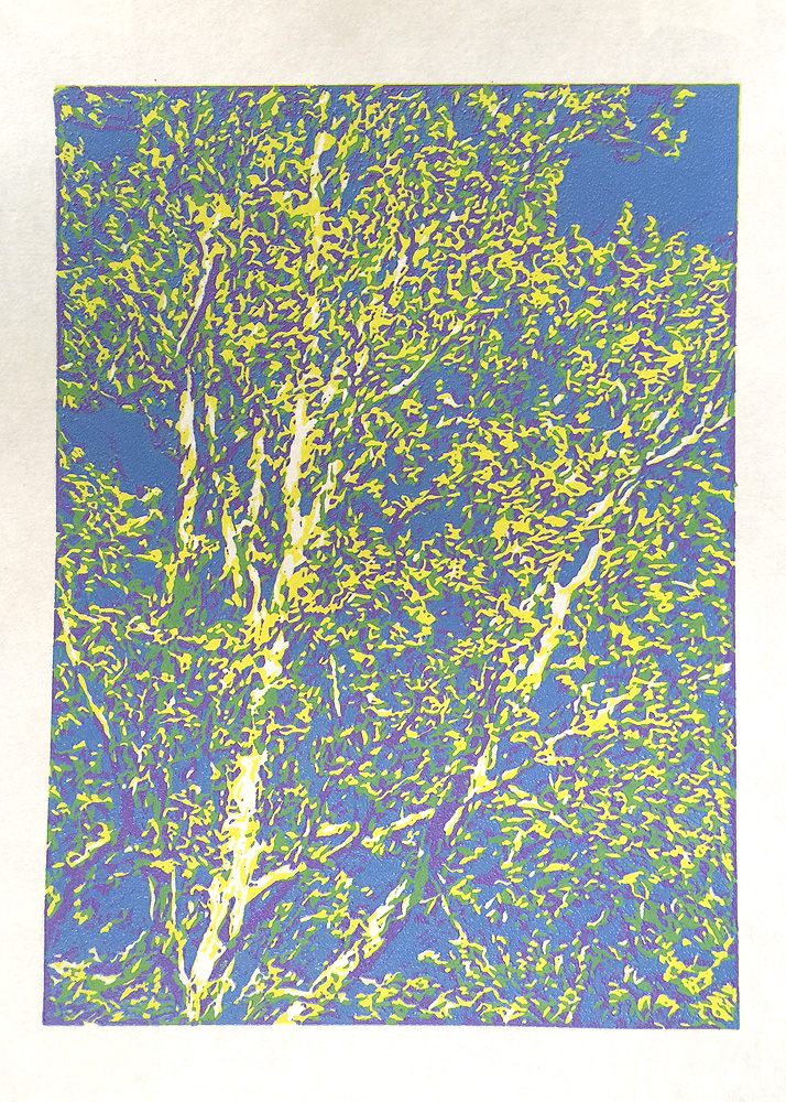
I'm up to the fourth color on my latest reduction linocut (two more colors to go). After the blue of the sky was printed, a lot of linoleum was removed, and there's not much area left to take ink because I'm down to mostly accent colors. When I was working with the image, I actually enhanced the image with a relatively saturated violet (because, obviously, as an artist, I have the ability to make nature look even better). In the final image, this color will only make up a small portion of the overall area, but the next two colors are much darker and will be much easier to print over the lighter colors.
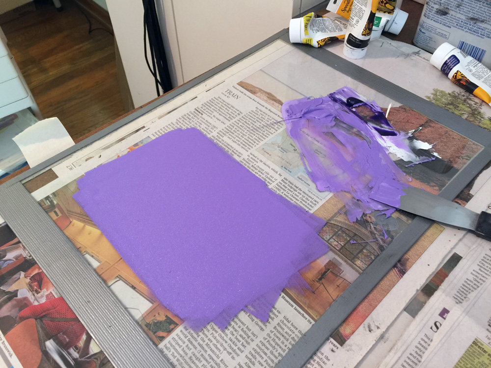
Violet is a very difficult color to mix with inks, so I used a "canned" version - Speedball's oil-based ink in a tube. I was told that this color would be discontinued, but I pray it isn't true. I can never get as rich a violet from mixing reds and blues currently available. I was expecting to have to add a little red because the color on my screen seemed to shift toward red, but when I mixed it with white, it was so rich and so close to the color I needed, I didn't want to chance it going pastel. I've been mixing my dwindling supply of Speedball inks with Gamblin's oil-based relief inks and it's working very well. Gamblin's titanium white is amazingly opaque - it has become a staple in my palette of relief inks.
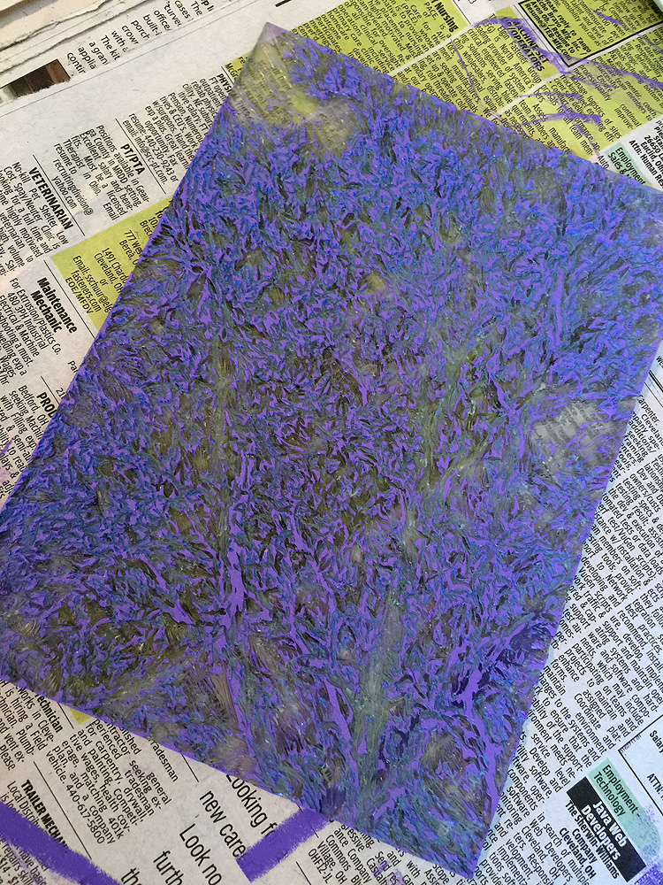
Here's the color rolled out, the plate, and the four-color print. I never cease to be amazed at how the different colors look from being rolled out to printed.


