prints, drawings, paintings, web development, blog posts, link to etsy shop
Moving the Four-color Process to Linoleum
Moving the Four-color Process to Linoleum
After relative success deconstructing and reconstructing images with my newly-developed 4-color process and the drypoint method, I felt compelled to do the same thing in my favorite printmaking medium, linoleum. I knew from the start that it would be difficult to carve out the colors on a linoleum plate because I wouldn't be able to get the fine-line detail that drypoint affords me. Nonetheless, I wanted to try. I decided to carve the linocuts similar to the drypoint - parallel lines in different directions. There would be much more overlap in a block print, so I would also need to be careful with the ink transparency.
By the time it was all done, I learned quite a bit about ink transparency, including which order to print the colors.
I chose an image and printed the separations out as black and white images from photoshop. I used an original image I took of a sunset and sized it as large as I could for my small press: 12 inches by 9 inches. I transferred the image to each block by lining up the same corner for each one. Then I carved out the images using parallel lines in different directions for each color: cyan/blue was vertical, magenta/red was horizontal, and yellow and black were diagonal in perpendicular directions.
The next step before printing was making sure that the images were going to line up - so I keyed off a detail in the image and made sure that the horizontal and vertical distances from the same edge were the same for each block. I trimmed the edges of the blocks where necessary.
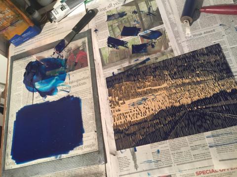
I started the print process by following the same order of colors as I used for the drypoint plates: cyan, magenta, yellow, then black. I knew the colors had to be much more transparent to deal with the overlapping areas, but everything was a disaster from the beginning because I started with the blue too dark and the yellow didn't work in the overlay. Here are a few photos of the first try at this process:
The blue was first, and because it was first, I didn't think it needed to be transparent. Unfortunately, that also meant it printed darker.
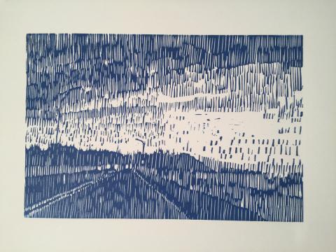
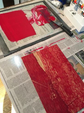
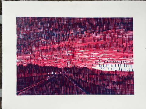
Magenta was second and the print actually looked nice with only the first two colors printed:
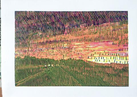
I had to make the yellow highly transparent, but even that didn't help it from making everything look slightly greenish:
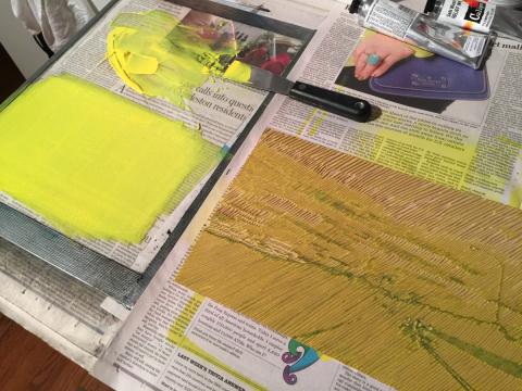
Here's a picture of the registration - I lined up each block at the top left corner of a homemade registration guide.
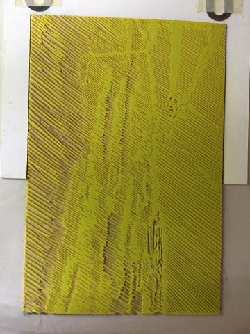
After that, and before printing the black, I started another set of prints using the colors in the opposite order: yellow - magenta - blue. I could use the yellow right out of the tube, but I had had to make the magenta and blue highly transparent. This print order worked out much better:
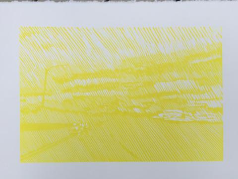
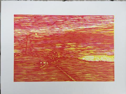
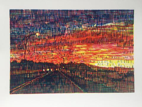
Then I printed the black for both sets of prints. The black actually saved the first set from being a total fail:
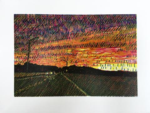
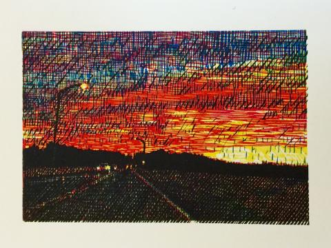
But the second set (colors printed in reverse order) had much richer color, I think you'll agree:
